Form error handling
Getting errors when submitting complex forms can be very frustrating for everybody, and it's specially time-consuming for assistive technology users because they need to go back and figure out where the error ocurred and what has to be done in order to complete this task.
Making forms and handling errors in an accessible way require good communication and a adoption of correct UI choices to semantic HTML markup.
Let's talk about the important things you need to consider now.
Don't rely only on colors
Because visually impairment people may not be able to recognize changes in color, you should not rely only on colors to announce errors. Even if the color change is not subtle, people with colorblindness cannot recognize the difference between green and red, for example, and other variations may impact recognition of other colors as well.
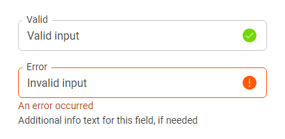
Using icons can help, but blurry vision can make it impossible to distinguish one icon from the other. So we must go even further than using colored borders and icons. Even for people with perfect sight you might need more information than that to clarify the error.
Error messages can be read by screen readers and will ensure that everyone can understand what's wrong with that form field.
Error and info messages
To have error messages be automatically read by screen readers you must first make them be "Live regions".
There are two options for error messages: "assertive" or "polite" depending on how critical the message is. As a rule of thumb, if you are using the "danger" color for the error message and it's something that will stop the user from submitting the form, use "assertive".
For other info messages, such as the info text that display auxiliary information (e.g.: a phone format message), you can use "polite".
For example:
<div class="flix-input--error">
  <span class="flix-input__info" id="error-message" aria-live="assertive">This is the input error message</span>
  <span class="flix-input__info" id="info-message" aria-live="polite">This is the input info message</span>
</div>
You must keep the info elements always present in the DOM, even if they are empty, and if an error occurs you can fill the element with text. This allows screen readers to recognize the presence of the live region and announce when it's contents are updated correctly. Screen reader support for live regions that are not present, or come in and out of the DOM is not very good.
You must also connect the info messages to the input that they are associated with, so screen readers can read them when the input receives focus. To do that, use the aria attribute aria-describedby on the input passing the message id as value.
Example:
<div class="flix-checkbox">
  <input class="flix-checkbox__input" required="" aria-describedby="agreeing-is-required" type="checkbox" id="agree" value="agreed"/>
  <label class="flix-checkbox__label" for="agree">
    I read the Terms and Conditions and Privacy Policy and agree with everything.
  </label>
  <span class="flix-checkbox__info" id="agreeing-is-required">
    This is required.
  </span>
</div>
Invalid fields
Even if you take good UI decisions and are adding icons and error messages to validate input fields, you still need to mark it as invalid (or valid) in the code to allow screen readers to tell the user that an input that is in focus is valid, invalid and then read the relevant error message to it that will explain why it's invalid.
To do that you must use the aria attribute aria-invalid on the input with value "true" or "false" depending on the input's state.
Notice the example bellow:
<div class="flix-textarea flix-textarea--error">
  <label class="flix-label" for="required-message">Message (required)</label>
  <textarea id="required-message" class="flix-textarea__field" required="" aria-invalid="true" aria-describedby="message-error message-info">  </textarea>
  <span id="message-error" aria-live="assertive" class="flix-textarea__info">This field is required</span>
  <span id="message-info" aria-live="polite" class="flix-textarea__info">Please add a short message to the courier</span>
</div>
When the screen reader focuses the textarea that have aria-invalid="false" and aria-describedby pointing to the error message, it will read something like so: "Textarea, invalid field, This field is required, Please add a short message to the courier".
Notice that you can add as many ids as value to aria-describedby and the screen reader will read
one after the other in the same order of the ids, so make sure to keep the same id order as the messages are shown.
What about aria-errormessage?
The aria-errormessage attribute is a very good addition to ARIA to separate the actual validation messages to other info related to an input field. This is going to make managing the ids a lot easier for developers as well as enable user settings for screen reader levels better. But, at the time of the writing of this guide (August, 2022) the support for aria-errormessage by major screen readers is not very good:
- JAWS has partial support on Chrome and Firefox and only works well on Edge.
- NVDA, VoiceOver and Windows Narrator has no support in any browser.
- Only screen reader with full support is Orca for Firefox.
So you must continue using aria-describedby until support improves as this is the most safe way to announce error messages for screen reader today.
More attributes for input validation
Besides aria-invalid="true|false", there are more HTML and ARIA attributes and that are important for form validation and screen reader support:
- You can use
aria-invalid="grammar|spelling"on text fields to deliver more specific information about why a text is invalid. - Required fields must always have the
requiredattribute to enable screen readers to announce them as such. - You can set the maximum and minimum values of numeric fields using
minandmaxattributes.
Disabled fields
Although disabling fields can be achieved by adding the disabled attribute, many times this approach is not good for accessibility because the disabled attribute will completely remove the element from the tab order, making them impossible to be focused with the keyboard.
So screen reader users can only find out that there is a disabled element if they choose to read out the entire page, since tabbing through it won't reach the disabled field.
An alternative to the disabled attribute is to use aria-disabled="true" instead, and handle the mouse clicks and tabs events on their side.
There is no cake recipe for whether you should use disabled or aria-disabled, this will depend on the feature and product you are developing.