Text
The written word is the essential core of this touchpoint. There are three main dimensions you can look at text:
- Official tonality/wording from Flix
- Understandable language & message
- Easy-to-scan & effective layout
| Text alignment | |
|---|---|
 |  |
| Avoid centered text alignment. It’s harder to read.* | Left-aligned text works best. |
| Mixing text styles | |
|---|---|
 |  |
| Do not use too many different text styles within one layout. | Stick to as few text styles as possible (3-4 should be enough). This will organize the content in a good way. |
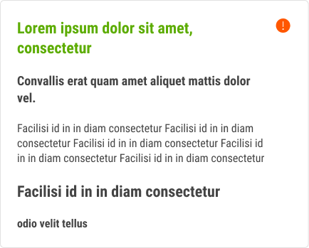
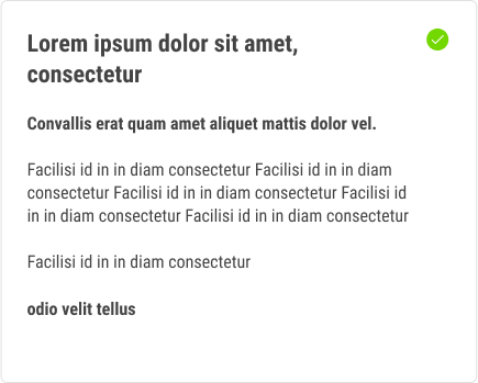
| Readability | |
|---|---|
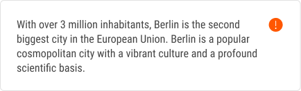 | 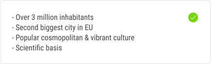 |
| Try to avoid big blocks of text/sentences.* | Use bullet lists as an alternative. They are easier to scan. |
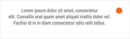
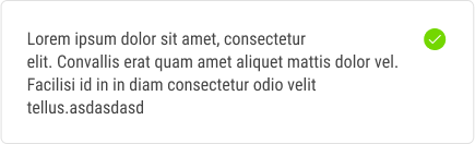
| Readability | |
|---|---|
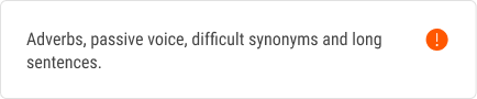 | 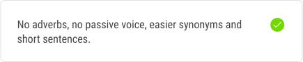 |
| Hard to read texts.* | Easy to read texts.* |
| Personalization | |
|---|---|
 |  |
| Try to avoid being too general. | Personalize the content and/or greeting. |
| Meaningful title | |
|---|---|
 |  |
| Try to find a title that points at what the e-mail is about. |
| Respect brand language | |
|---|---|
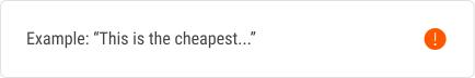 |  |
| There are certain words and phrases we try not to use. | Use our writing guide to find alternatives and stick to a consistent wording. |
| Make it relevant | |
|---|---|
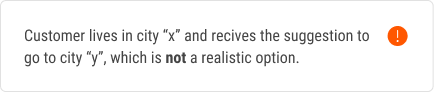 | 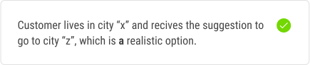 |
| Even if the customer does not consider it now, the customer still has the feeling he/she somewhat reaslistic information from us. |
Sources
- https://www.w3.org/WAI/tips/writing/ (Official W3C standards)
- Why You Should Never Center Align Paragraph Text
- https://www.hemingwayapp.com (Scan + rate of text readability)
- https://alistapart.com/article/standards-for-writing-accessibly/
- https://blog.prototypr.io/7-guidelines-for-writing-accessible-microcopy-8d52575f5d8e
- https://wiki.mfb.io/display/UIUX/Accessibility+and+inclusivity+checklist